(Want your website to look more appealing? Check out these cutting-edge website designs and trends that can be a gamechanger)
Your website can only do a successful job of attracting the desired traffic if it is designed well. Undertaking period evaluation to check whether any aspects of the website can be refreshed can help you stay on top of your game.
Website redesign services place special emphasis on checking whether the design on your website is as per the trends so that it is more successful in keeping the visitors engaged.
Want to know the cutting-edge website designs and trends every web design company is currently choosing? Read on to discover nine cutting-edge trends and website designs to make your website more user-friendly:
Table of Contents
- 1 9 Cutting Edge Website Designs and Trends
- 1.1 1. Black and White
- 1.2 2. Add More Auto-Play Videos
- 1.3 3 . If You Are Not Paying Attention to Inclusivity, You Are Doing It Wrong
- 1.4 4 . Opt for Dark Mode, Wherever Possible
- 1.5 5 . Embrace Negative Space
- 1.6 6 . Include Chatbots Wherever Possible
- 1.7 7 . Don’t Underestimate Animated Elements
- 1.8 8. Opt for a Scrapbook Aesthetic
- 1.9 9 . The Time for 3D Illustrations Is Now
- 2 Conclusion
9 Cutting Edge Website Designs and Trends
1. Black and White
We are surrounded by colors. But you may feel that your brand identity is not truly expressed by these Day-Glo colors. In such cases, web design companies in Los Angeles will recommend you opt for a black-and-white palette.
It is an excellent option if you want the visual elements and typography on your website to stand out and grab the audience’s attention as soon as they land on the page.
The black-and-white combination is timeless and classic, best suited for brands that want to add a touch of minimalism to their website. Choosing this theme can also help you drive home your principles and values as a brand.
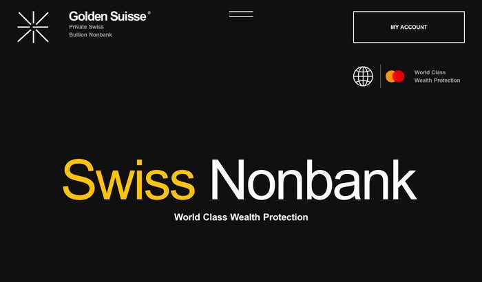
Take, for instance, the website of a Swiss nonbank, Golden Suisse. As a private bullion nonbank, Golden Suisse prides itself in delivering ultimate wealth protection and privacy.
A black-and-white theme with just a touch of color does a great job of amplifying the message. It looks and feels exclusive –just what you’d expect such a bank to do.

2. Add More Auto-Play Videos
Videos are a great way to capture audiences’ attention who find it hard to concentrate on text alone. There is an increased possibility of the visitor becoming a lead after watching a video about your product.
But not all videos are made equal. If you want them to make a difference, embrace the current trend of opting for auto-play videos. Make them the hero of your home page, and keep the length under two minutes. Avoid using any loud music or explain the video entirely through voiceover.
Most people prefer watching videos with the sound off — so a self-explanatory video that drives home the message without being too intrusive is just what the doctor ordered.
3 . If You Are Not Paying Attention to Inclusivity, You Are Doing It Wrong
Your website needs to cater to all types of audiences. Ensuring that your account is for the needs of disabled visitors can go a long way in building brand loyalty.
The bottom line is simple — everyone visiting your website should be able to interact, understand, and navigate your website. If there is one trend that you should definitely aim to embrace, it is this.
There are a few ways you can do this. For example, every image on your website should be accompanied by relevant ALT text that the screen readers can read out loud. Make sure to describe every image in great detail and as clearly as possible.
Pay attention to the colors and contrasts used on the website. Avoid using any color combination that can put a strain on the eye. Add descriptive URLs to assist visually impaired audiences.
Small steps such as these can make a massive difference to the overall user experience.
4 . Opt for Dark Mode, Wherever Possible
The dark mode is no longer restricted to apps alone.
A significant number of web designers are choosing a darker design to give overstrained eyes well-deserved relief. Given the increased screen time that has taken over our lives, this is a move in the right direction.
If you make the website more pleasing and relaxing to look at, you will undoubtedly receive more engagement on your content. It can also help visitors stay on your website for a little longer and save their laptop/mobile batteries from draining too quickly.
5 . Embrace Negative Space
Adding ample whitespace on your website is a great way to make it more aesthetically pleasing. Mindlessly cluttering the website can make it extremely difficult for visitors to stay engaged with your content.
You must provide enough breathing space to every element on your website, so they receive the attention they deserve.
Moreover, negative space is a great way to make the website look and feel more luxurious. It makes for an easy read and helps you to deliver the message effortlessly.
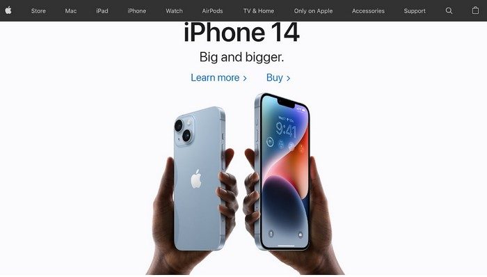
A stunning example of a website including negative space correctly is Apple. The website uses white space intentionally to shine the spotlight on the product and nudge the audience toward the desired call to action.

6 . Include Chatbots Wherever Possible
Even though chatbots are not a recent phenomenon, their popularity has soared in the past few years due to the proliferation of machine learning. Chatbots are now an essential tool for businesses to establish a solid connection with visitors right off the bat.
Some of the frequently asked questions can be answered by making your chatbot act like a virtual assistant without employing any additional human resources.
However, keep in mind that no chatbot, however masterfully designed, can do it all. The goal should not be to rely on chatbots alone to hit the desired conversion. Instead, the focus should be on using it to optimize the user experience.
7 . Don’t Underestimate Animated Elements
If you are aiming for micro-interactions with your users, animated elements can come to your rescue. Be it product reveals or explainers, animation can keep the audience engaged and deliver the message effortlessly.
Triggered animation, in particular, gets activated as soon as one hovers the cursor of their mouse over an image or element, which can be useful to draw attention to a specific part of your website.
It can also make the audience feel that they are directly involved with the content they are consuming.
8. Opt for a Scrapbook Aesthetic
A scrapbook web design feels extremely personal and can make users feel that they are actually flipping through a magazine instead of simply scrolling a website.
By including simple design elements such as handwritten lettering, graphics, and doodles, you can develop a deeper sense of intimacy in user experience.
This design trend shows that perfection is not the ultimate goal, and not everything needs to be aligned to complex technology or feel too gimmicky.
A simple layout can go a long way in ensuring that the browsing experience becomes a positive memory for the users.
9 . The Time for 3D Illustrations Is Now

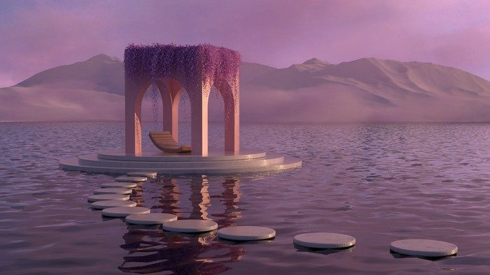
In the past few years, 3D illustrations have emerged as a super trendy design element to include in your website. The sky is the limit when it comes to how much you can experiment with them and use them in various ways.
Apart from increasing the attractiveness quotient of your page, they can also help to garner the desired clicks from your audience. And when your website stands out from hordes out there with flat illustrations, your traffic and SEO both get a boost, resulting in higher revenue and conversion.
The better you are at connecting with the customer, the lower the chances of experiencing a high bounce rate and low engagement.
Conclusion
Need help with modernizing your website designs to embrace the latest trends? Get in touch with a web development agency specializing in helping small businesses have stellar websites. Providing your website with a much-needed facelift is all you need to beat the competition and grab more customers.
Editorial Staff at WP Daily Coupons is a team of WordPress experts led by Peter Nilsson.

