It’s a fact: typography is one of the most important parts of any graphic design project. Some might even say that it’s the most important part of such a project. In other words, in order to be an exceptional graphic designer, you must learn the 10 most important principles of typography.
These principles will help you emphasize important parts of the design, make the content easy to read, avoid common mistakes, and even make effective use of white space. So, without further ado, let’s discuss the 10 most important principles of typography (the ones every designer should know in 2019).
Table of Contents
- 1 Use Perfect Kerning and Leading
- 2 Align Your Type Correctly
- 3 Use Font Size Correctly
- 4 Use No More Than Three Fonts
- 5 Secondary Fonts Are Important
- 6 Choose Your Font Palette Carefully
- 7 Use Font Communication to Your Advantage
- 8 Use Negative Space to Your Advantage
- 9 Readability Is Your Priority
- 10 Don’t Fall for the Latest Typography Fads
- 11 Conclusion
- 12 Author
Use Perfect Kerning and Leading
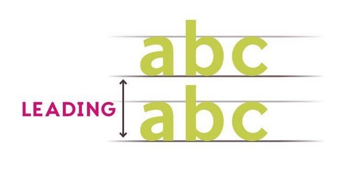
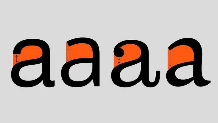
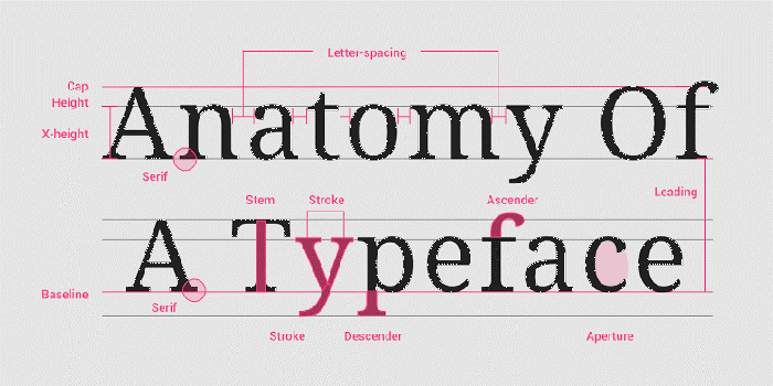
Kerning and leading are very important, so you should dedicate some time to finding the perfect values. Kerning is the horizontal space between characters, while leading is the vertical space between text lines.
As you can imagine, adjusting the kerning and leading values makes the text easier or more difficult to read or scan. You need to strike the perfect balance between these two values in order to make the content as easy on the eyes as possible.


Align Your Type Correctly
One of the most important principles of typography, correct alignment is often overlooked by novice designers. It may sound like a good idea to use the Center Aligned or Justified option on the entirety of the content, but it is actually not. It just makes the content difficult to read, so many readers will simply ignore it.
You should only center specific parts of the content that need to be emphasized. For the rest of the content, Flushed Left is the best option because text formatted with this option looks natural and is easy to read. People expect the content to start from the left side of the page.
Use Font Size Correctly

Yes, a larger font can emphasize certain important aspects of the design. It will get your readers’ attention. However, use bigger fonts only when it is necessary because using them too often will have negative consequences on your design.
Also, remember to keep the size difference between the large font and the normal font below 6 points. As a side note, bolding is equally effective at emphasizing important content – and it looks better in most cases.
Use No More Than Three Fonts
You should avoid mixing many fonts together, period. This is a mistake many novice designers make. The problem with mixing four or five fonts together is that it makes the text difficult to scan. Instead, use just two or three fonts in each design. Utilizing one font for headings, another for subheadings, and the third one for paragraphs is the best way to go.
Secondary Fonts Are Important
The principles of typography are clear: pay attention to secondary fonts. The primary font is the font used for the text, while secondary fonts are fonts used for headings and subheadings. Of course, you can have three different fonts, and the fonts can be from the same typeface or from different typefaces. However, you need to make sure that each secondary font pairs nicely with the main font.
Choose Your Font Palette Carefully
Did you know that you can set the right mood just by using the right colors? In fact, good color usage is at the top of the list of good principles of typography. Color research is an important part of a designer’s work, and you should learn how to make effective use of colors to communicate a specific message. Furthermore, keep in mind that using certain colors can influence the mood of your readers.
Use Font Communication to Your Advantage
Just like colors have an influence on the mood of your readers, the typeface you use has an impact on the way you are communicating the message. Obviously, to set an appropriate tone you need to know your audience. For example, Serif fonts are formal, while Comic Sans is comical. Sans-serif fonts are clean, while Script fonts are elegant. Use the typeface that resonates best with your audience.
Use Negative Space to Your Advantage
One of the lesser-known principles of typography, making effective use of negative space can be difficult to master. For instance, white space can help you emphasize certain parts of your design (the reader can focus on just the typography). It also allows your typography to breathe and enables you to create a clean, organized design. Use white space wisely!
Readability Is Your Priority
Content should be easy to read, period. The design needs to ensure that readers do not struggle to read the content. Otherwise, said readers will simply hit “Back” in their Web browser and leave the page.
To prevent this from happening, your design should not have dark text on a dark background or bright text on a bright background anywhere. Also, avoid using a very small font; most people absolutely hate having to zoom in to read the text.
Don’t Fall for the Latest Typography Fads
Trends come and go, but these important principles of typography remain the same. They’ve remained the same for years, and will probably remain the same for years to come. Trends change rapidly, so a design you think will last for a few years will become old fashioned in just a few months. In other words, avoid typography fads and stick to the eternal principles.
Conclusion
In conclusion, there are just 10 things to keep in mind at all times if you want to achieve perfection in your designs. Master the 10 principles of typography outlined here and your work will look clean and professional. You will make an impact on readers and clearly communicate your message to any audience.
But remember, correct grammar and punctuation are very important as well. These principles of typography will help you create professional designs that will effectively communicate your message, but ensuring the said message doesn’t contain bad grammar is entirely up to you.

Author
Shubhi Dengre, Digital Marketer at Pixelo.net.
Editorial Staff at WP Daily Coupons is a team of WordPress experts led by Peter Nilsson.

